
Top 10 IT Support Website Designs

Video
In today's digital age the IT Support industry plays a vital role in driving business growth and success. With more and more companies adopting technologies to streamline their operations the competition among IT service providers has intensified.
A well-designed, professional website has become a key differentiator in this landscape as it serves as the first point of contact between businesses and their potential clients. The IT Support industry also has no barriers to entry (certifications, etc.) for startups. It's therefore even more important to showcase your brand as an established, trustworthy, professional service.
We believe the very job of a website is to build trust with it's audience. Websites build this trust by presenting a well designed, modern, professional front in addition to delivering the information users need efficiently. If a website engages the user with design, structure and copy it should build trust and encourage prospects to take the next step in the buying process.
In the following sections, we'll explore the Top 10 IT Support Website Designs that have excelled in these areas and discuss the design elements that make them stand out from the crowd.
Good Design
What makes a good IT Support Website?
We've outlined that a website needs to build trust with it's users in order to fulfil its function. After building trust a websites function is to sell:
- Having a user/ prospect become a warm lead (call, email)
- Providing enough impact (recognition) that if it's not the right time to buy the user can find the way back to your service
So how does design play a role in creating a good IT Support website?
Design plays a critical role in creating a good IT support website and reflecting the personality of a brand/ company. A website that is aesthetically pleasing and easy to navigate can create a positive user experience that builds this all essential trust and credibility.
An effective website design should be able to guide the user's attention towards the most important information and call-to-actions, making it easy for them to take the desired movements; such as making a phone call or submitting an inquiry form.
Additionally, a good design should be mobile-friendly and responsive, as a significant portion of website traffic comes from mobile devices.
Structure and Copy
The website's structure should be intuitive and easy to follow, guiding the user through the key information in a logical sequence. The copy should be clear and very importantly concise. It's all too often we see long paragraphs that despite holding great information are too lengthly to engage most website users and therefore are skipped in favour of shorter, snippier info.
Language also plays a vital role. Copy needs to be easy to digest and aimed at your target audience who are likely less of an expert in the subject as yourself.
Structure plays a vital role also. Sometimes a website can dramatically increase its impact just by repositioning sections. We recently helped shape a website that hosted an incredible number of reviews. This company was so fortunate to have such great feedback, nevertheless, prior to us getting our hands on it the information sat buried at the bottom of the page.
Users are on your website to find information whether this be an in depth look at your services or simply a chance to give themselves an impression of your business. Answering the common questions that potential clients may have makes it easier for clients to take the next steps. Additionally, this information should be persuasive and focused on the user's needs and pain points, emphasising the solutions that the IT support company can provide.
Lets now take a look at the top 10 IT support websites that have excelled in both design, structure and copy and therefore provide the experience necessary to build trust and convert prospects into customers.
NUMBER 11
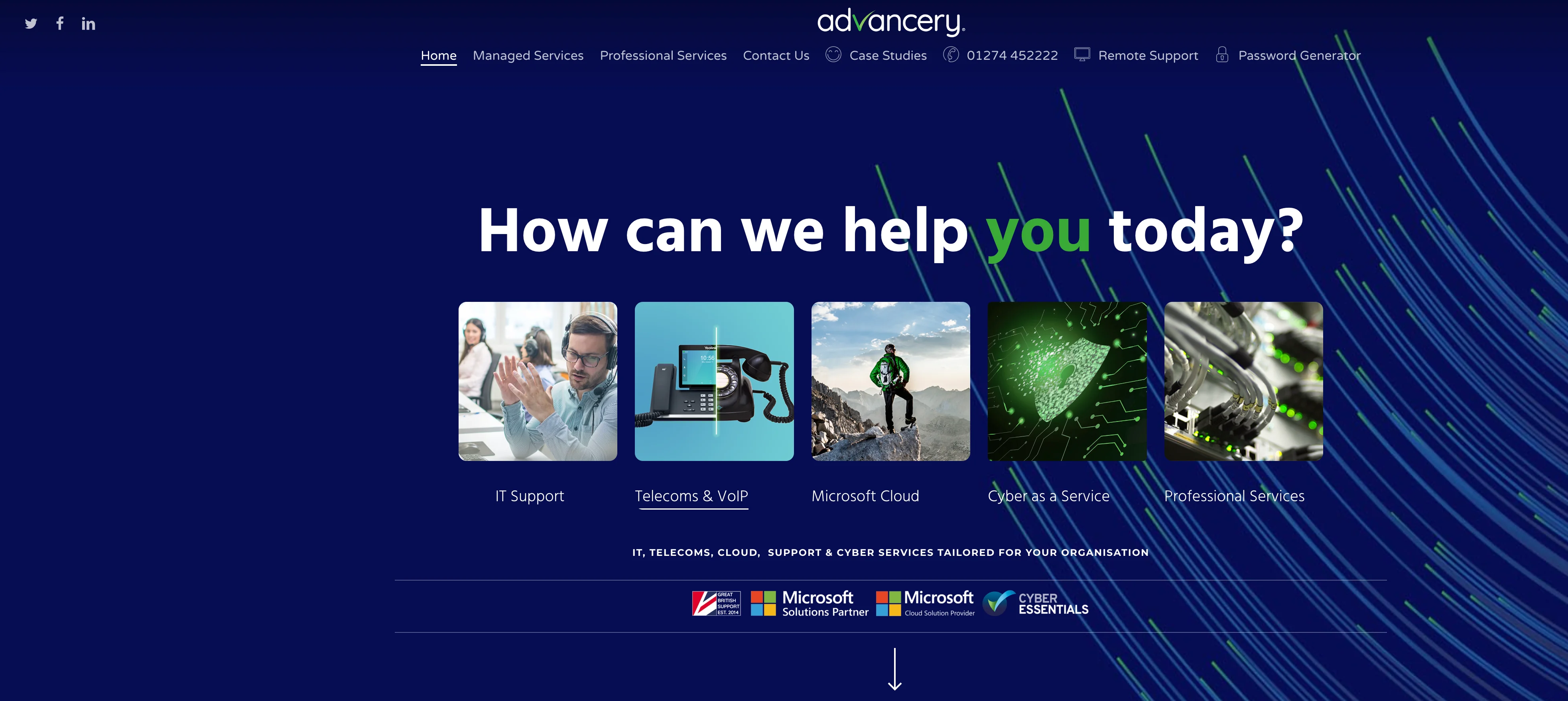
Advancery
Employees: 10-20
Advancery ranks because it's nice to see something a little different work. We're not crazy about the "How can we help you", nevertheless the hero section of their website showcases their services in addition to some well balanced certifications/ partner logos (Microsoft Gold, Cyber Essentials etc.).
There's a touch too much information as you scroll but continue further and it's a well put together homepage. However, I did reduced Advancery's ranking after further usage of the website. Following the homepage the website starts to feel dull and unfinished.
Advancery use consistent branding (colours, image feel, text) as well as display information that allows Advancery to stand out (namely, testimonials and case studies).
WE LOVE
- Use of colours
- Different Header/ Hero Section
- Testimonials
WE'D CHANGE
- Although the website has a great start, it feels like unfinished. It's loses what the homepage delivers on it's services pages.
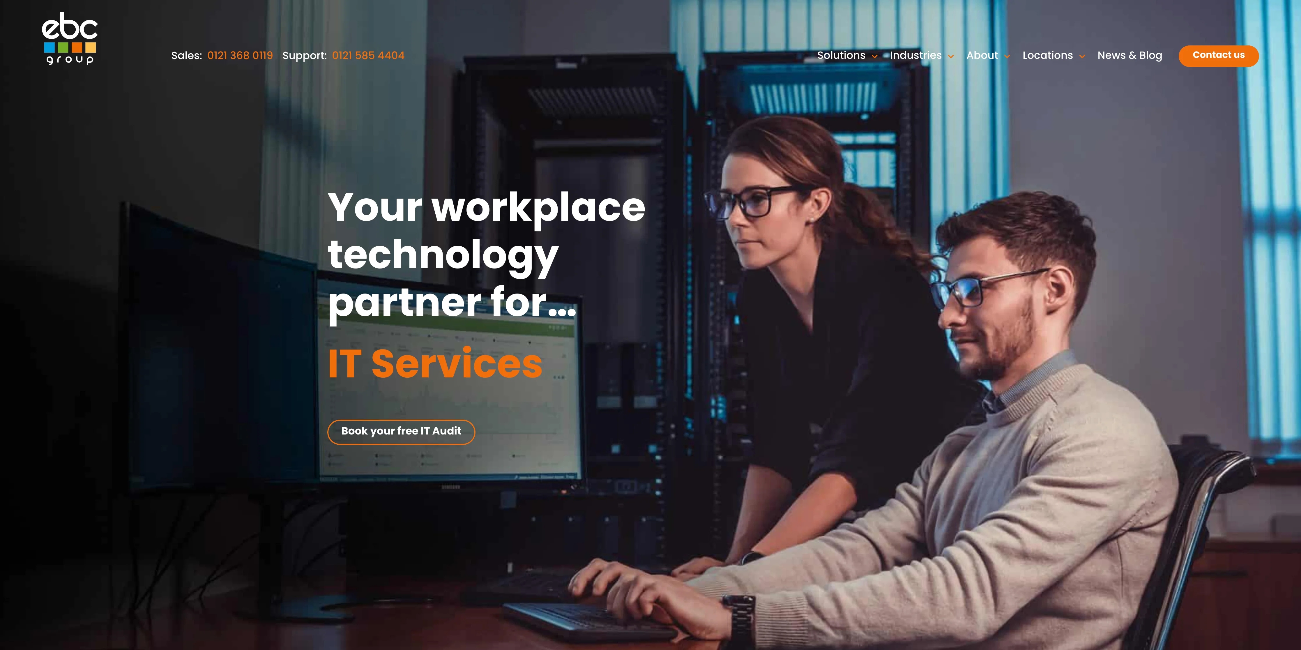
NUMBER 10
EBC Group
Employees: 50-100
We're not the biggest fan of EBC's logo (feels a little 'insurance') however we love their website! With a full image opening that outlines the separate services EBC offer it's a fun, clear start to your user journey.
The homepage structure also delivers. ECB clearly outline some reasons as to why you should partner as well as continuously displaying phone numbers with a fixed menu.
WE LOVE
- Hero section
- There's a quiz - Call to action
- Great Insights and News
- Large menu that works well on mobile
- Industry menu section
- Headshots are great.
WE'D CHANGE
- The menu is a bit over the top in places, when hovering over About you're confronted with seven choices
- We're not a massive fan of the full width fixed images and how they interact with scroll (a little 2015).
NUMBER 9
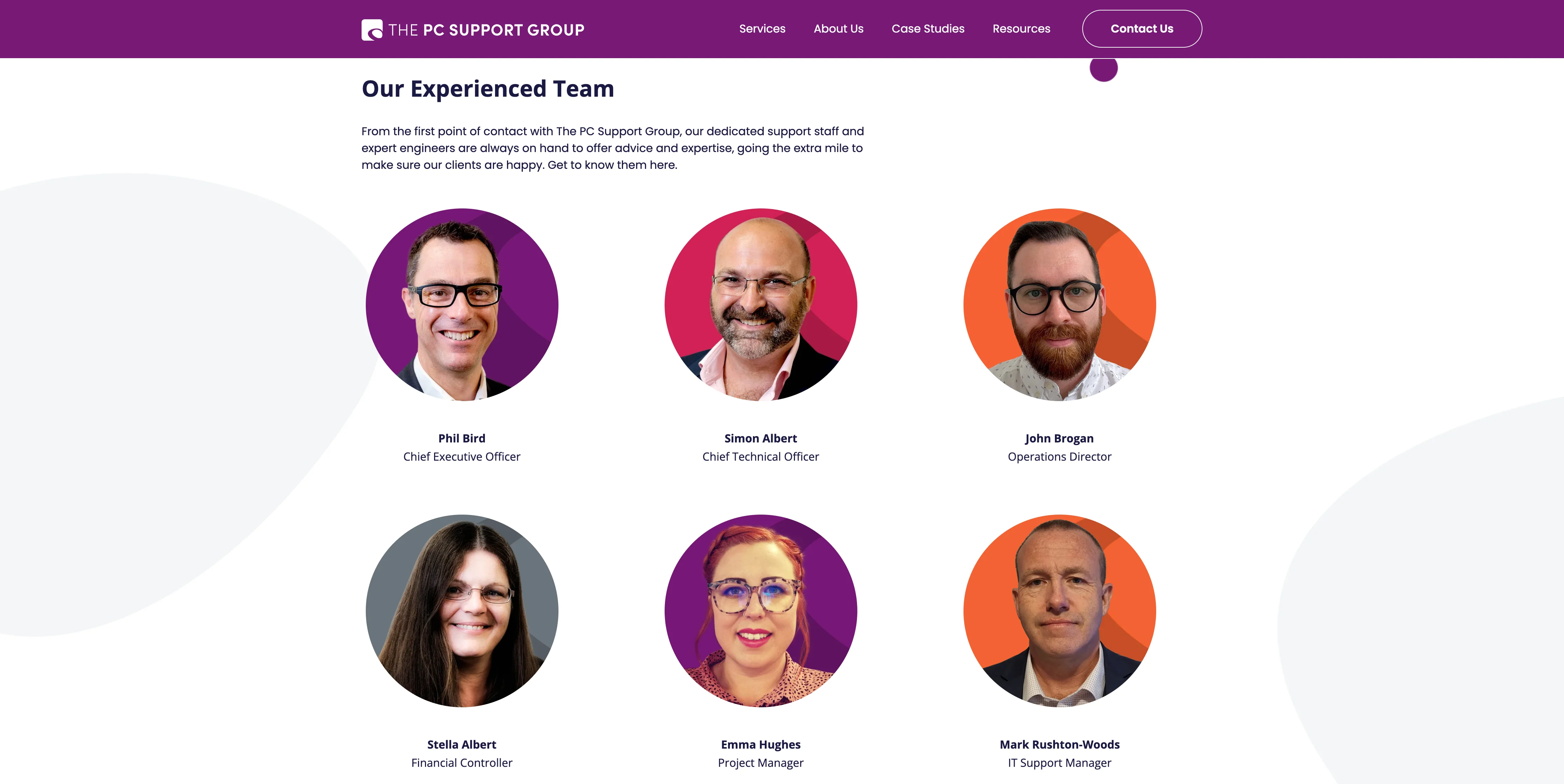
The PC Support Group
Employees: 20-50
The PC Support Group is just a lovely clean website. It's got a great structure that displays information without cluttering the page with text. It's let down by their use of stock images over which take away from giving it an individual identity, nevertheless the website is well put together, easy to navigate and has some great calls to action (download now, sign-up, book a meeting now).
NUMBER 8
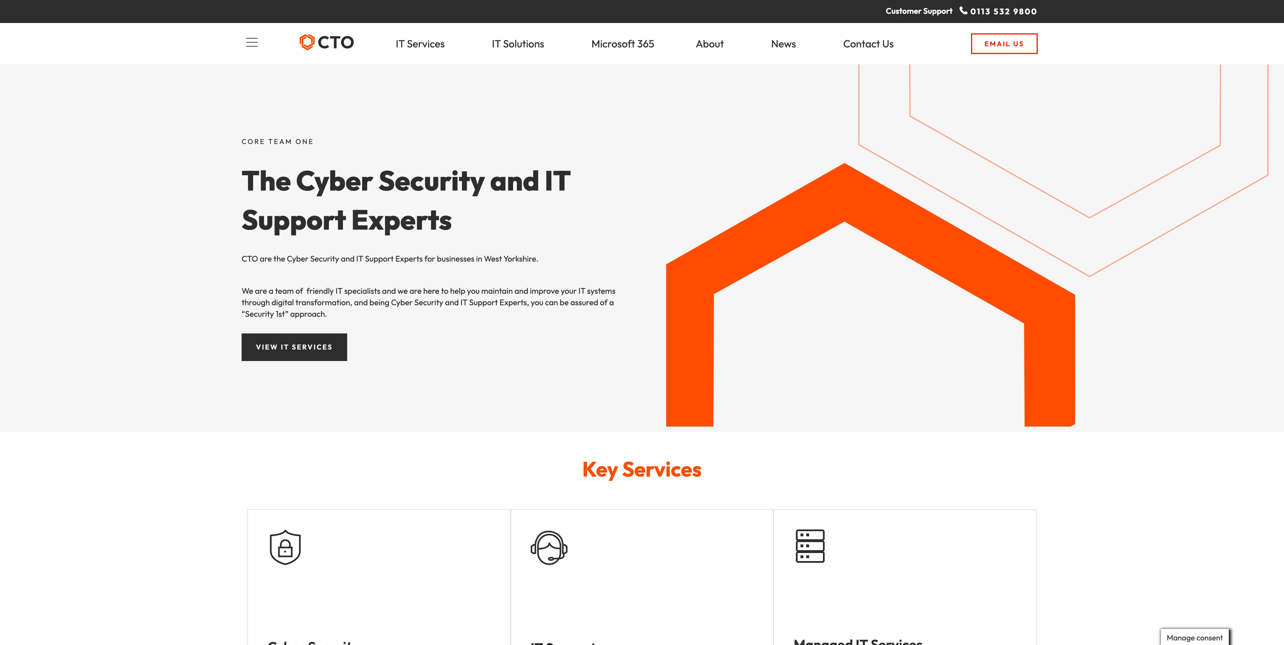
CTO - Core Team One
Employees: 10-20
Visually the website opens fantastically. The use of various greys as well as orange work very well. Unlike Number 11 (Bluecube) their title, "The Cyber Security and IT Support Experts" explains exactly what they're about. As you scroll further down the colour scheme takes a bit of a hit but it's still consistent and does a great job at outlining services, customer testimonials as well as outlining the solutions they offer.
WE LOVE
- Banner phone number
- Website Title
- Service pages aren't too long and display information effectively
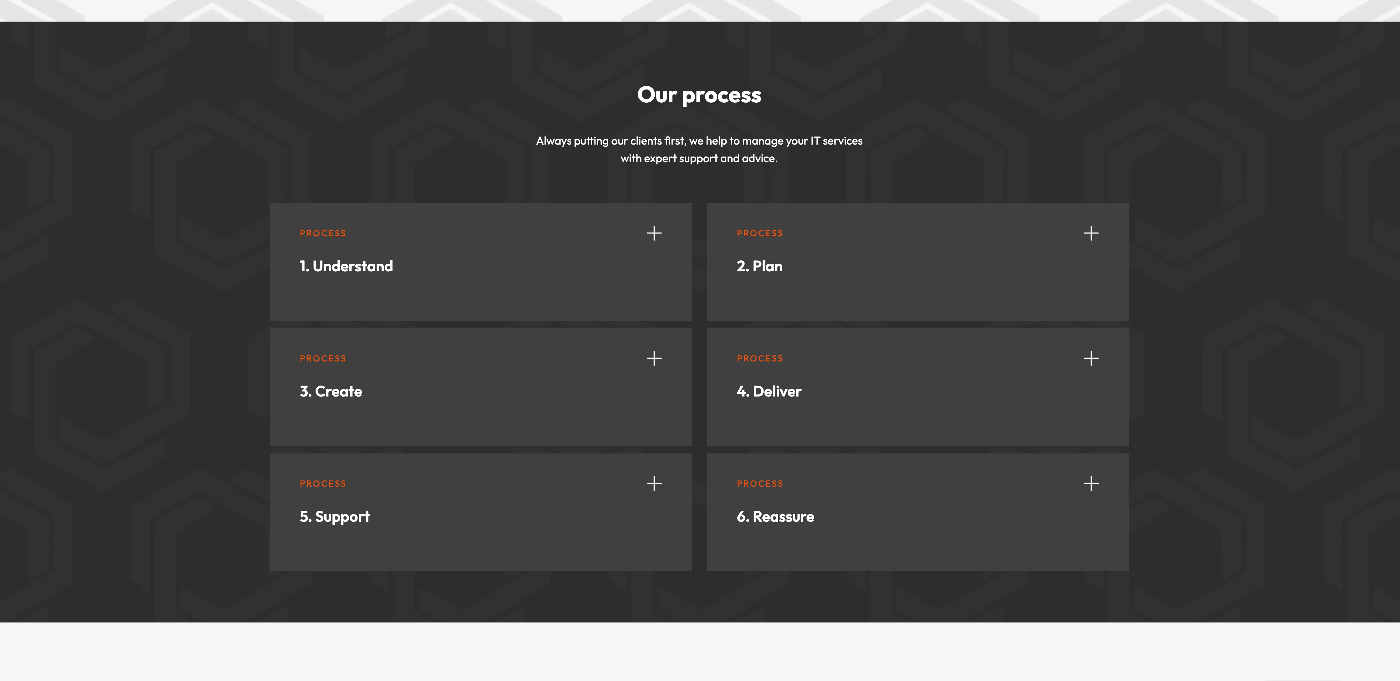
- The website also outlines processes which make customers feel more comfortable with their buying journey and the steps that follow
- The menu positioned on the left is fun.
WE'D CHANGE
- The website has a great professional technological feel but we'd make it a little warmer on the About Us page. There's not any employee images and they don't take the opportunity to let their guard down... just a little.
NUMBER 7
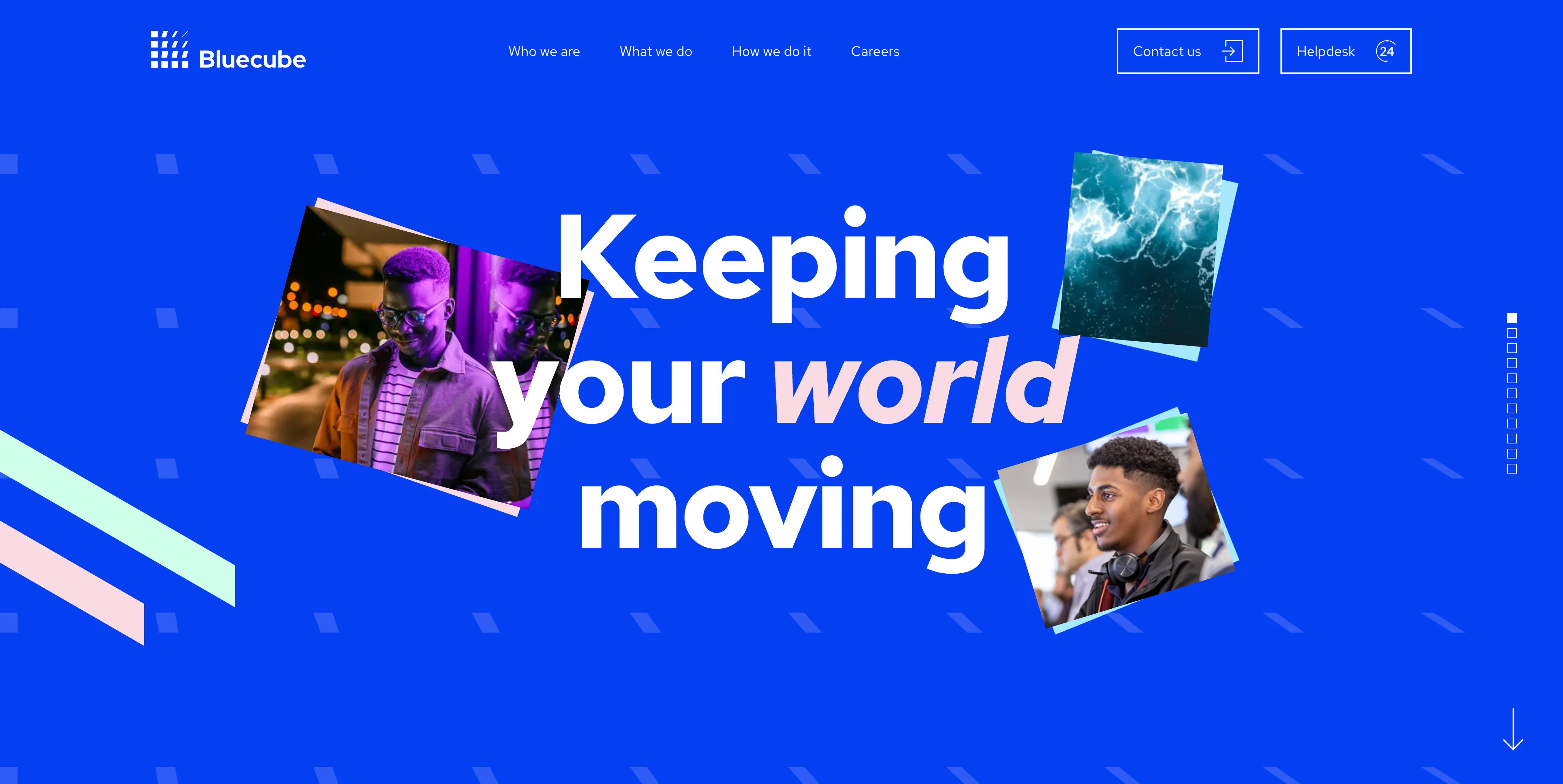
Bluecube
Employees: 100-200
Presenting a lovely clean website, Bluecube. Bluecube showcases some great design as well as being fun, vibrant but also professional. Despite this, we believe falls short in a couple of ways:
WE LOVE
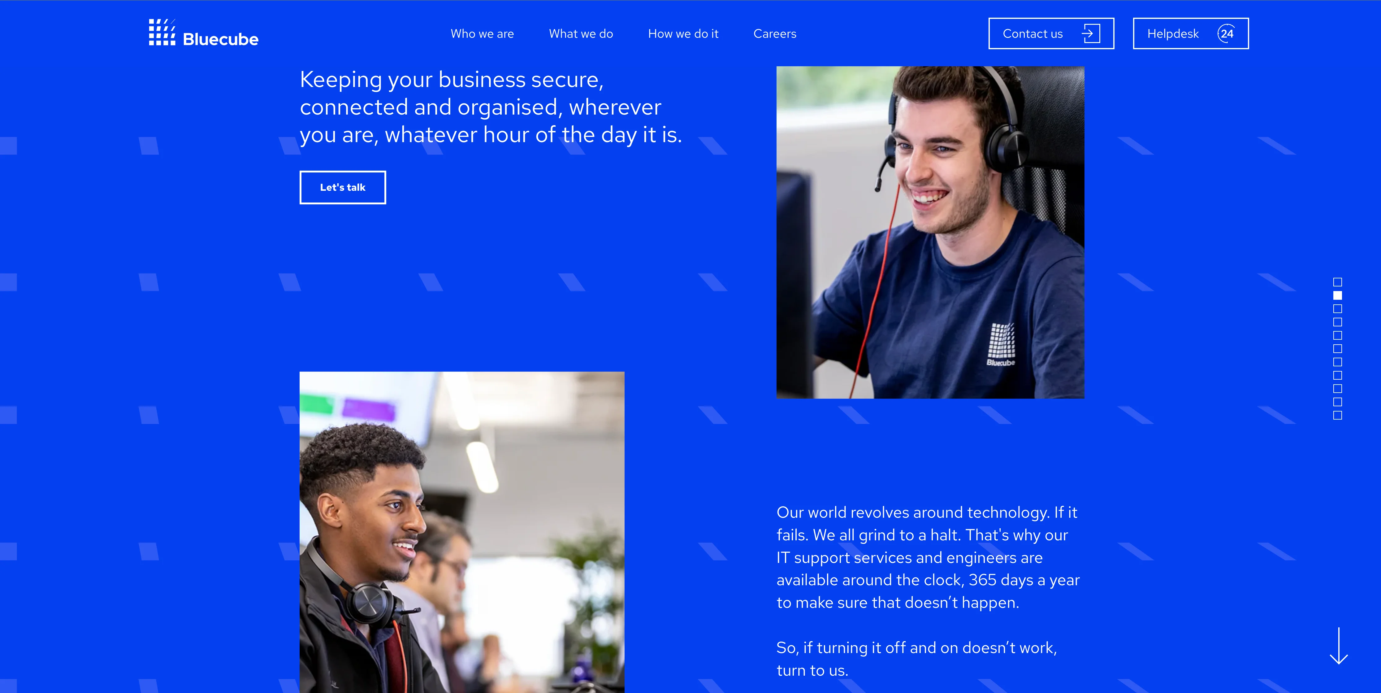
- Clean Design
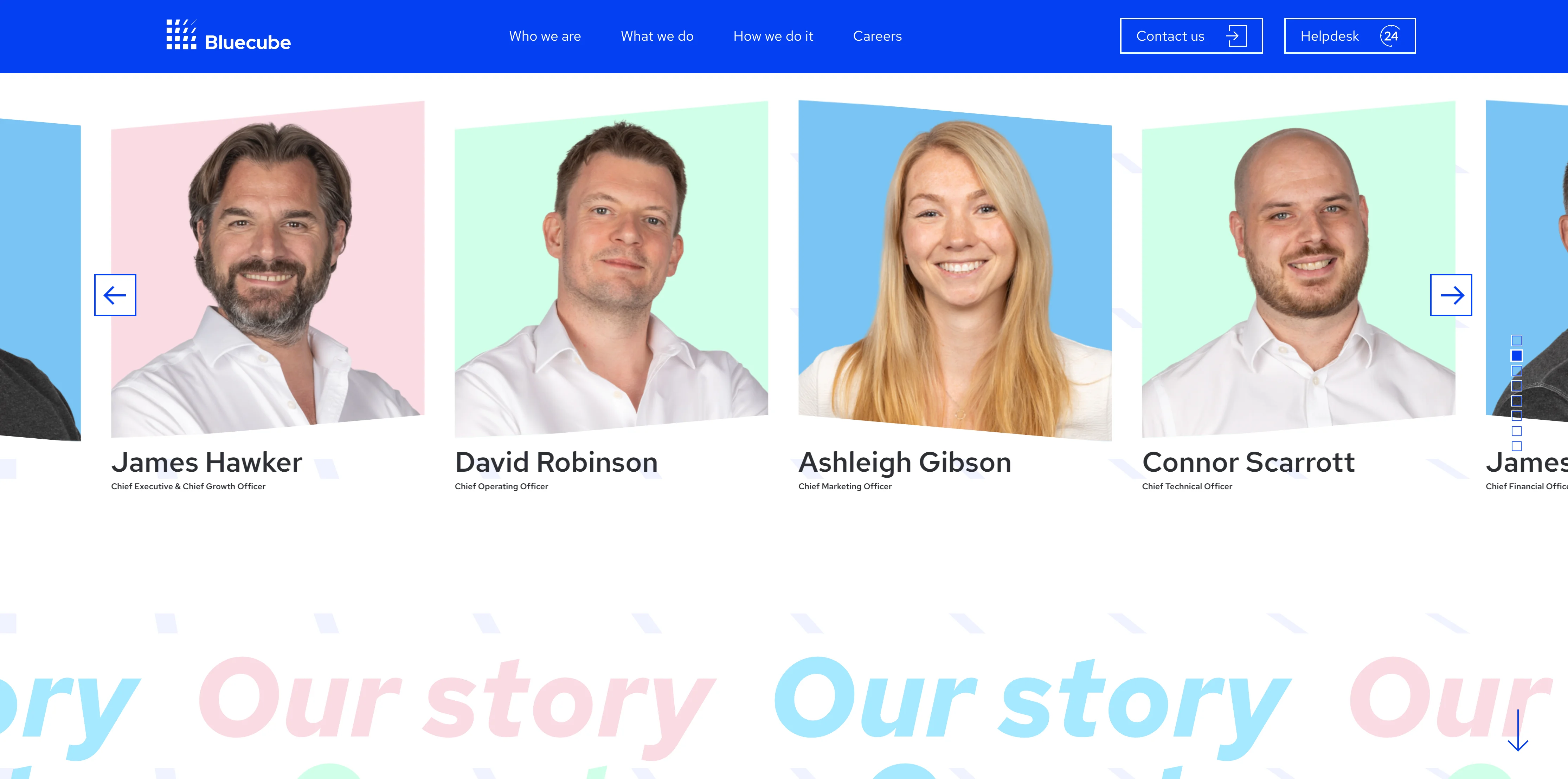
- Use of personal/ branded images (employees working + great headshots)
- Client stories
- Clean easy to navigate menu
- Works well on mobile.
WE'D CHANGE
- Title: We love the 10 step rule. Take 10 steps back from a screen, can you tell what the business does? Bluecube title, "Keeping your world moving" is catchy but not functional. We favour function
- Having a video on the homepage is great (Google also approves [SEO]) however the video doesn't really provide any insight or takeaways expect showing their nice office in one image
- The blue 'flecked' background is great but becomes tiring. We wish they'd pivoted away from this background design after a bit of scrolling.
NUMBER 6
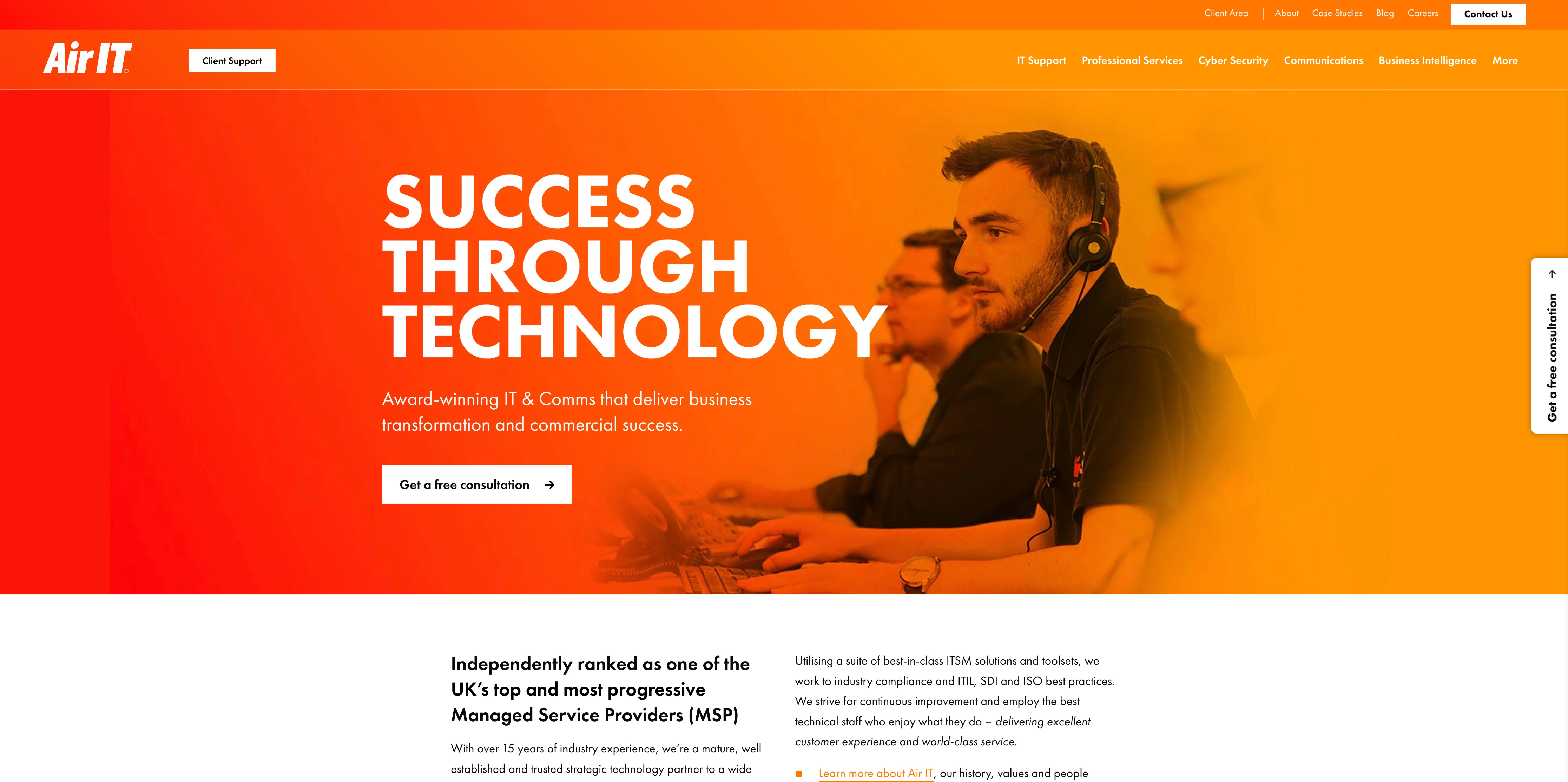
Air IT
Employees: 300-500
Air IT's website has some great takeaways. The consistent headers at the top of each page are bright a massive sunrise block. Anyone returning to Air IT's website will know if they've been on it before!
We also think they've done a great job with images throughout. No stock images for Air IT, you can clearly see smiling employees in Air IT uniform. The picture of their building accompanied by office locations also highlights the businesses size with both text and visually.
Lastly despite being a big company their navigation is extremely clean. Each service doesn't include a dropdown and therefore makes the decision much easier.
WE LOVE
- Bold consistent colours
- Team images
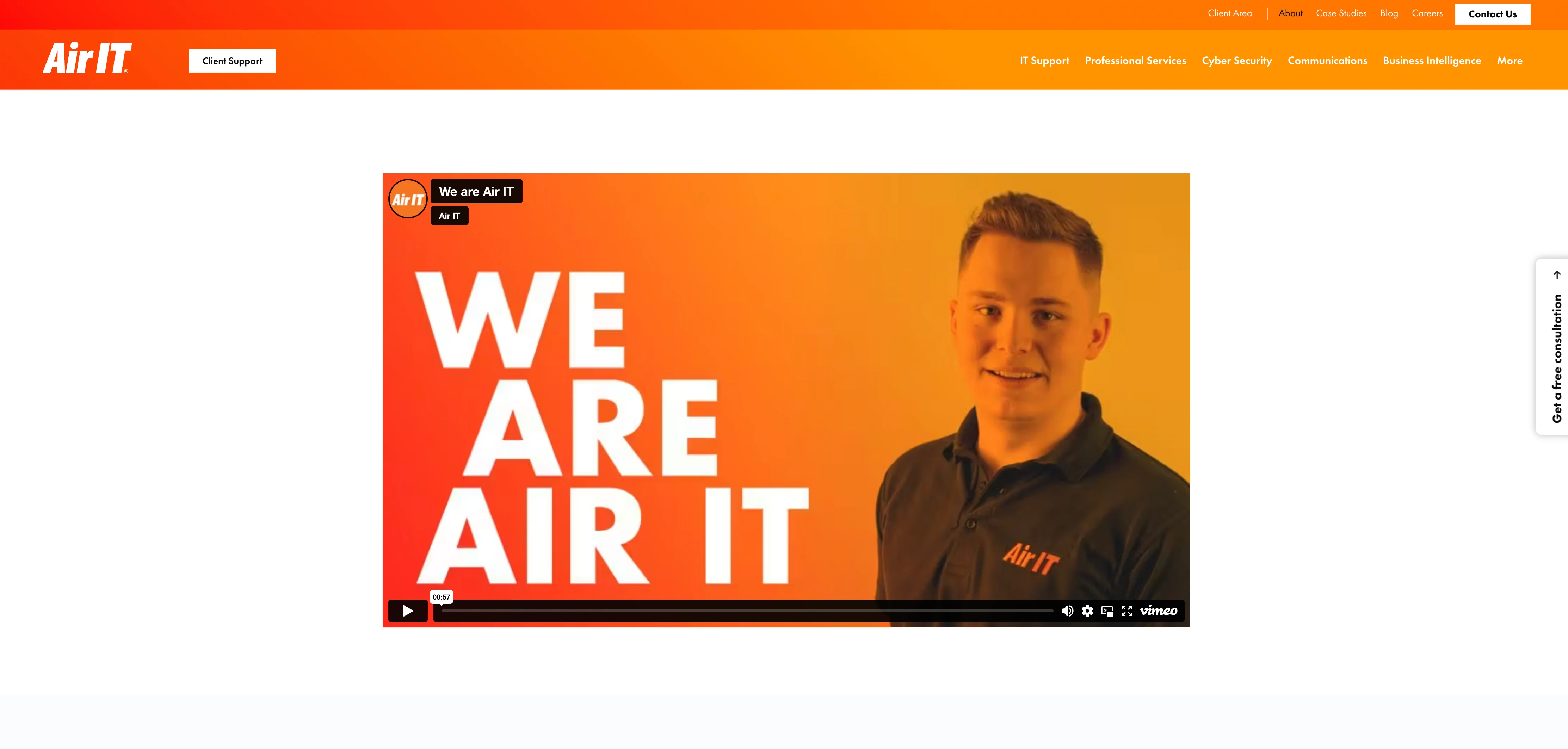
- Video on About page is a touch cheesy but it does a really good job at showing scale. It's very well put together and left me smiling.
WE'D CHANGE
- The homepage style feels very consistent but some services pages are a little loaded (cluttered) and loose the consistency
- The header images (of Air IT team) aren't visible on mobile. Without the images the page feels a little dull and not as friendly.
NUMBER 5
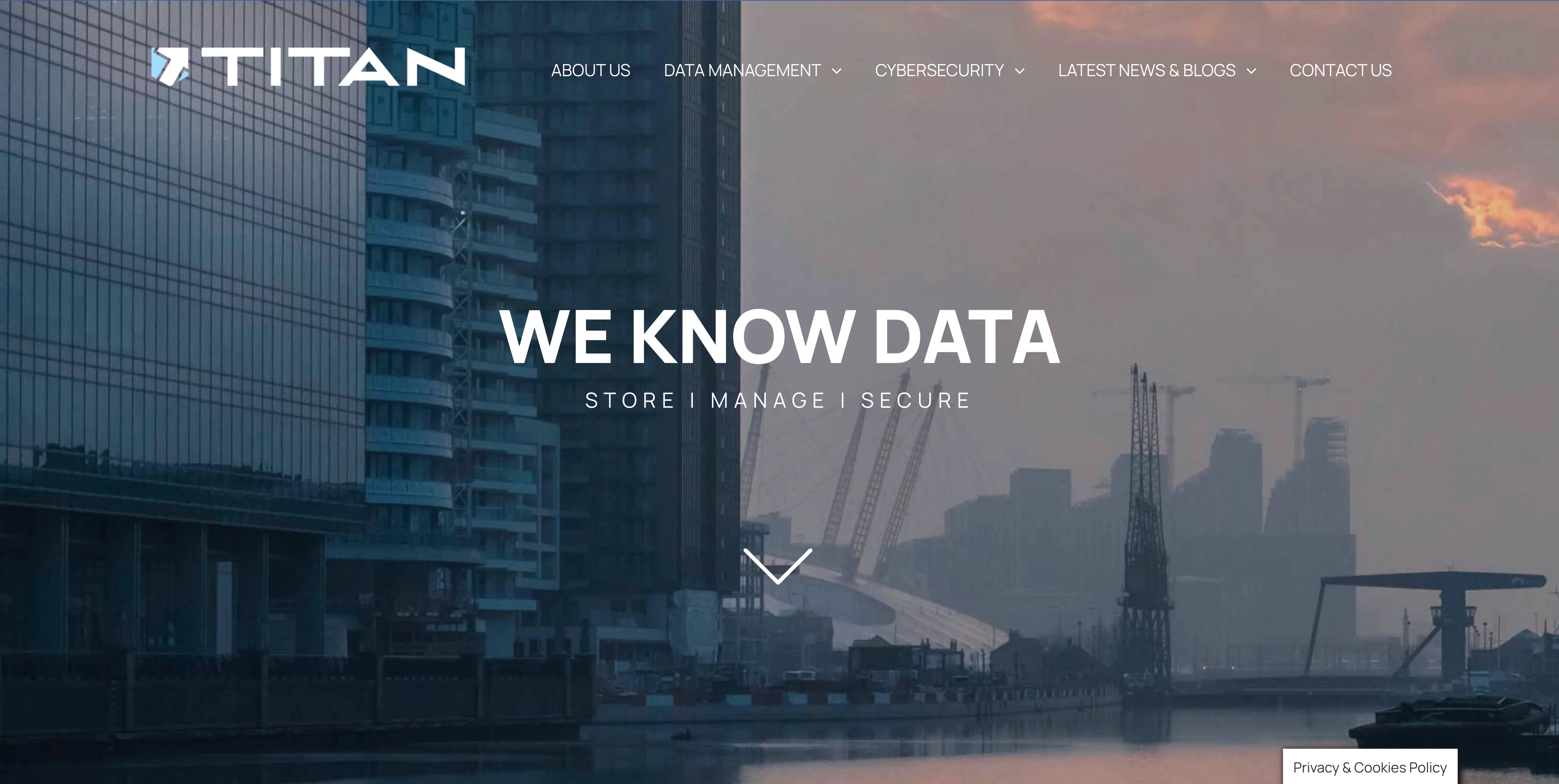
TITAN Data Solutions
Employees: 30-50
Titan shouldn't be in this list but is. Titan aren't IT Support, they're a Data Management solution. Despite this Titan's website has been on my personal 'inspo' (inspiration) list for some time and I showcase it whenever I get the opportunity so why stop now!
There's a lot about Titan's website that I'm not a fan of. It feels a little flat at times and it jumps in and out of being dark and light without consistency. It's navigation menu is so plain and confusing it actually hurts me a little. HOWEVER, I absolutely love this website and continuously return to look. Why is that?
It's the image and title. Titan have got it 100% right. There's such a sense of power and authority emanating from the image and title. "We Know Data" both delivers exactly what they do and seemingly does so effortlessly.
A great title is a start, but the background image is the star of the show. The colours line up perfectly with their dark purple brand and this ray of hope in the clouds. Without getting too technical it reminds me of a Turner painting (The Fighting Temeraire).
Despite my praise there are things to consider if choosing darker colours on a website as it looses it's friendly element, nevertheless if you wish to shout strength and security Titan have hit a home run.
NUMBER 4
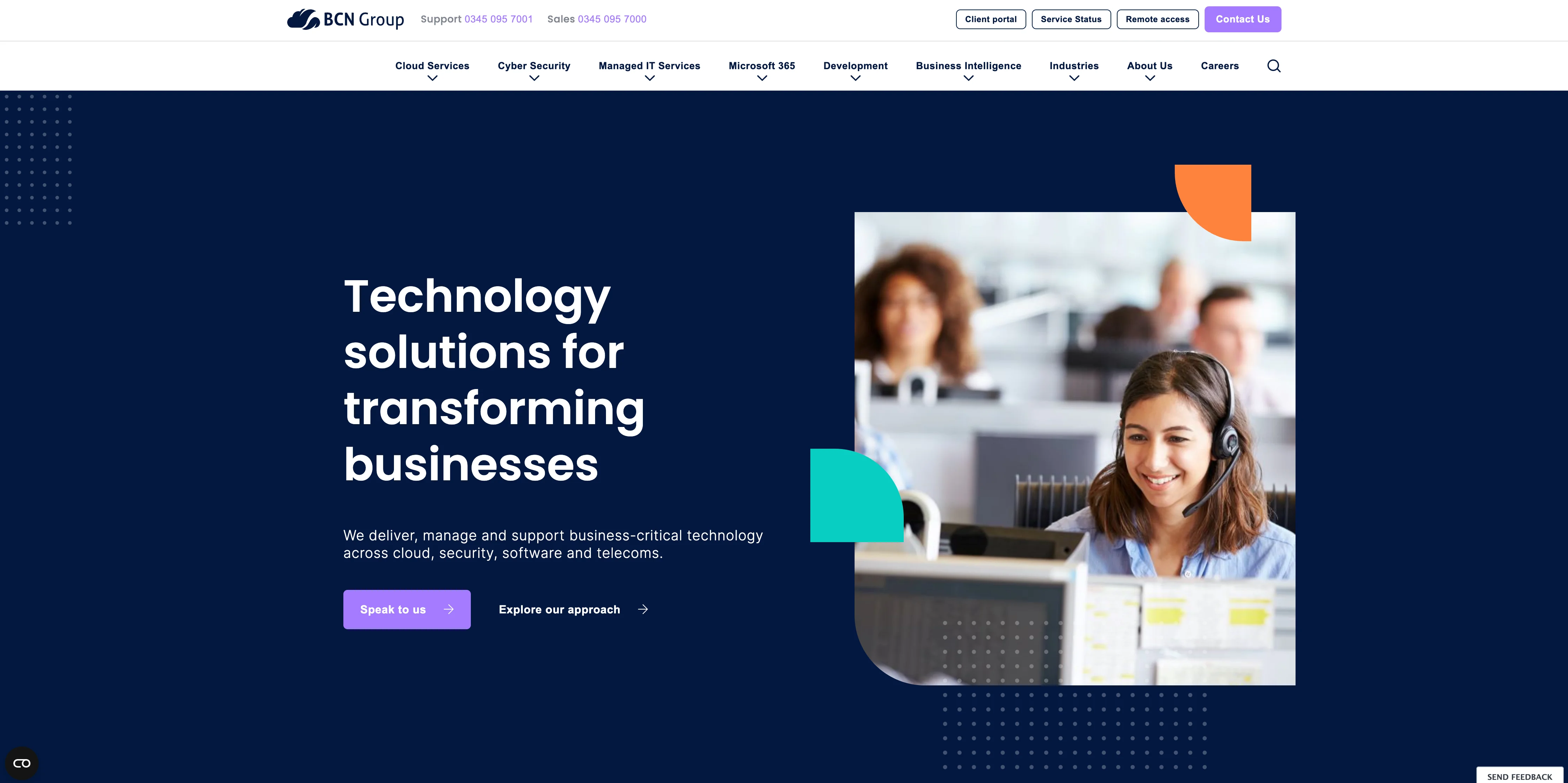
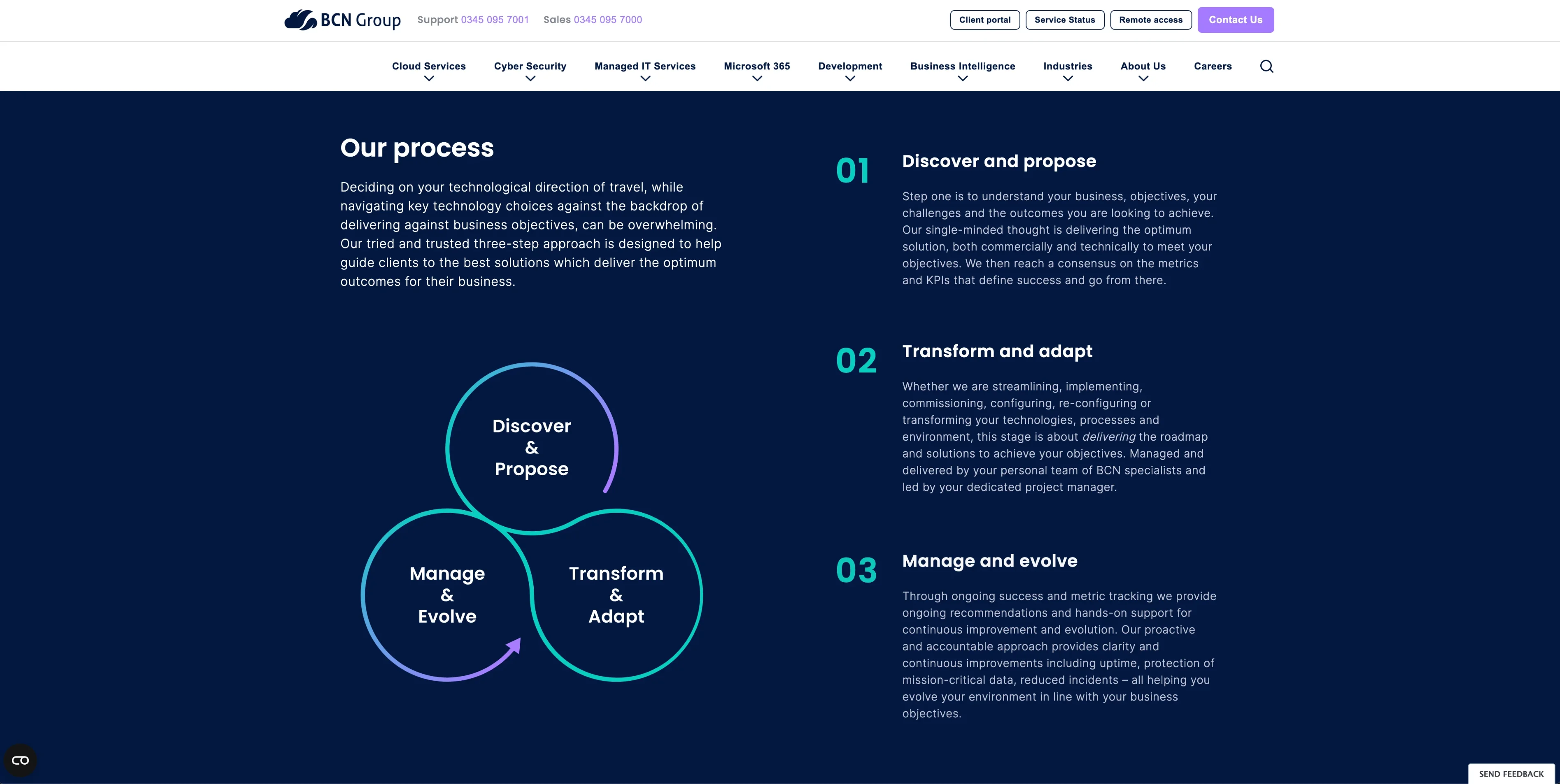
BCN Group
Employees: 250-350
Really nice website with some great interactions that engage.
Like so many of these top websites it's the stock images that are a let down. It's not easy to get away from the ease of using stock images. Hiring a photographer adds additional costs to a potentially expensive endeavour. The internet is full of 'perfect' images of employees wearing headsets and smiling a smile much richer than you'll find your employees deliver! Despite this, these seemingly 'perfect' images (stock images) take away from a business feeling real. The use of stock images that have smiles dialled up to 1000% make the business feel much less personal and therefore detracts from the trust the website is trying to build.
BCN have a great website and it's consistency and layout combined with an excellent mobile experience are why we gave it the number 4 space! A small investment however would offer big impact.
NUMBER 3
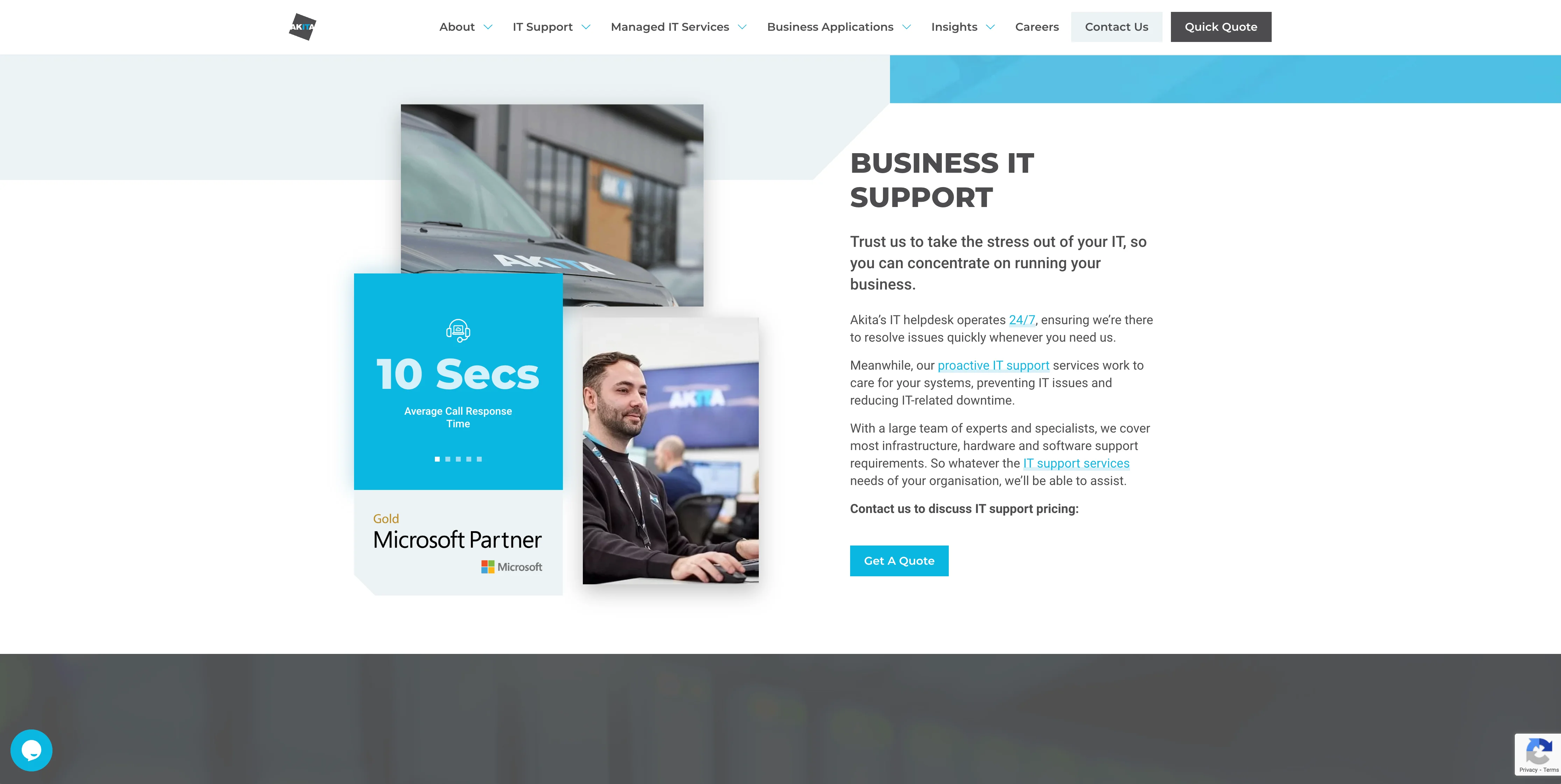
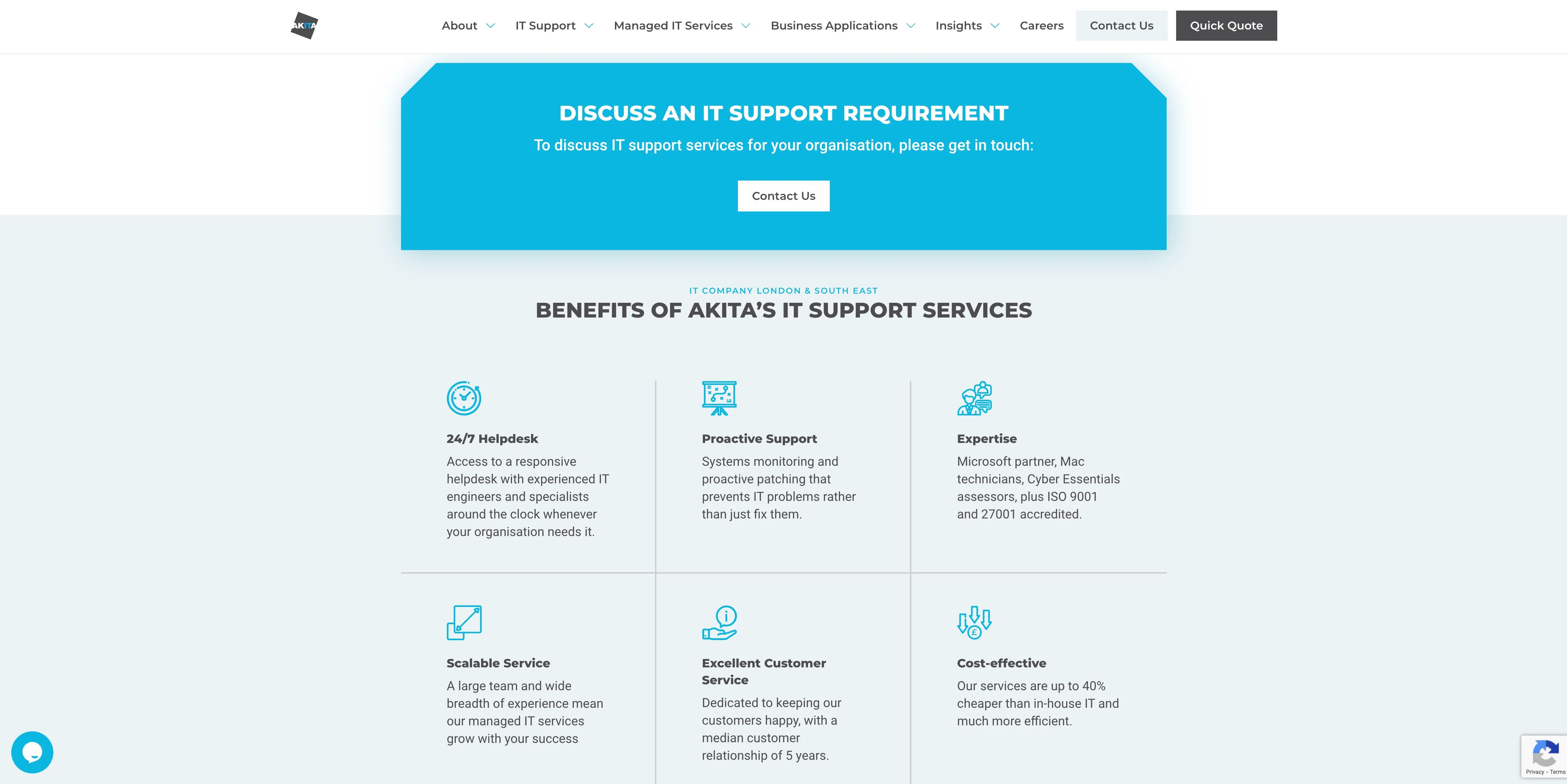
AKITA
Employees: 50-150
Akita's homepage feels pixel perfect. The use of branding and colours is consistent throughout. Pages have movement but not don't overwhelm users. The call to actions ("GET IN TOUCH") are bold but don't intrude.
As you move away from the homepage and toward services pages the website draws on stock images a little too much. It's a shame because they're intermingled with their own much more impactful images on the About Us page.
Overall the website is a testament to spending time on the basics and being rewarded for it.
NUMBER 2
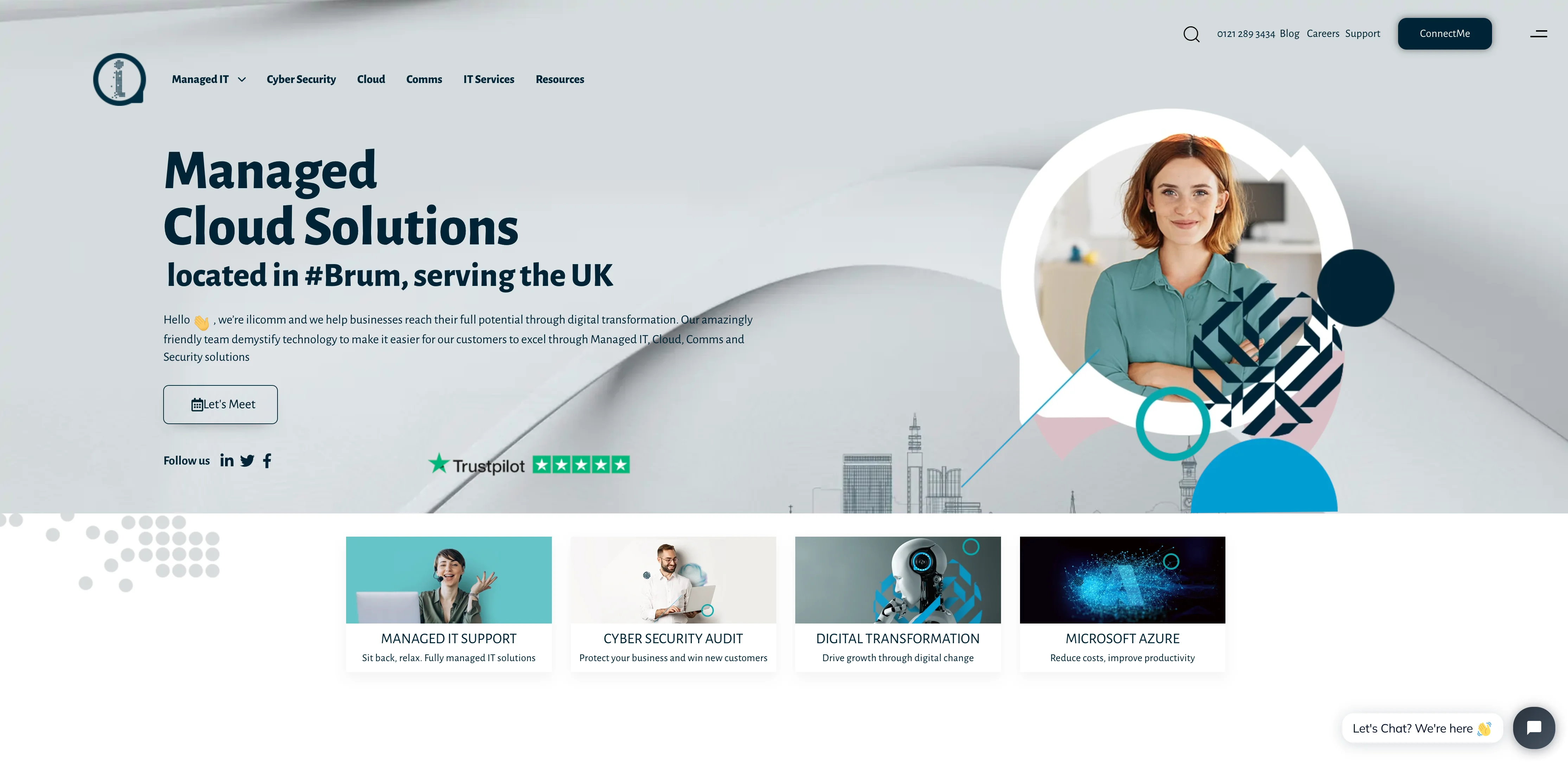
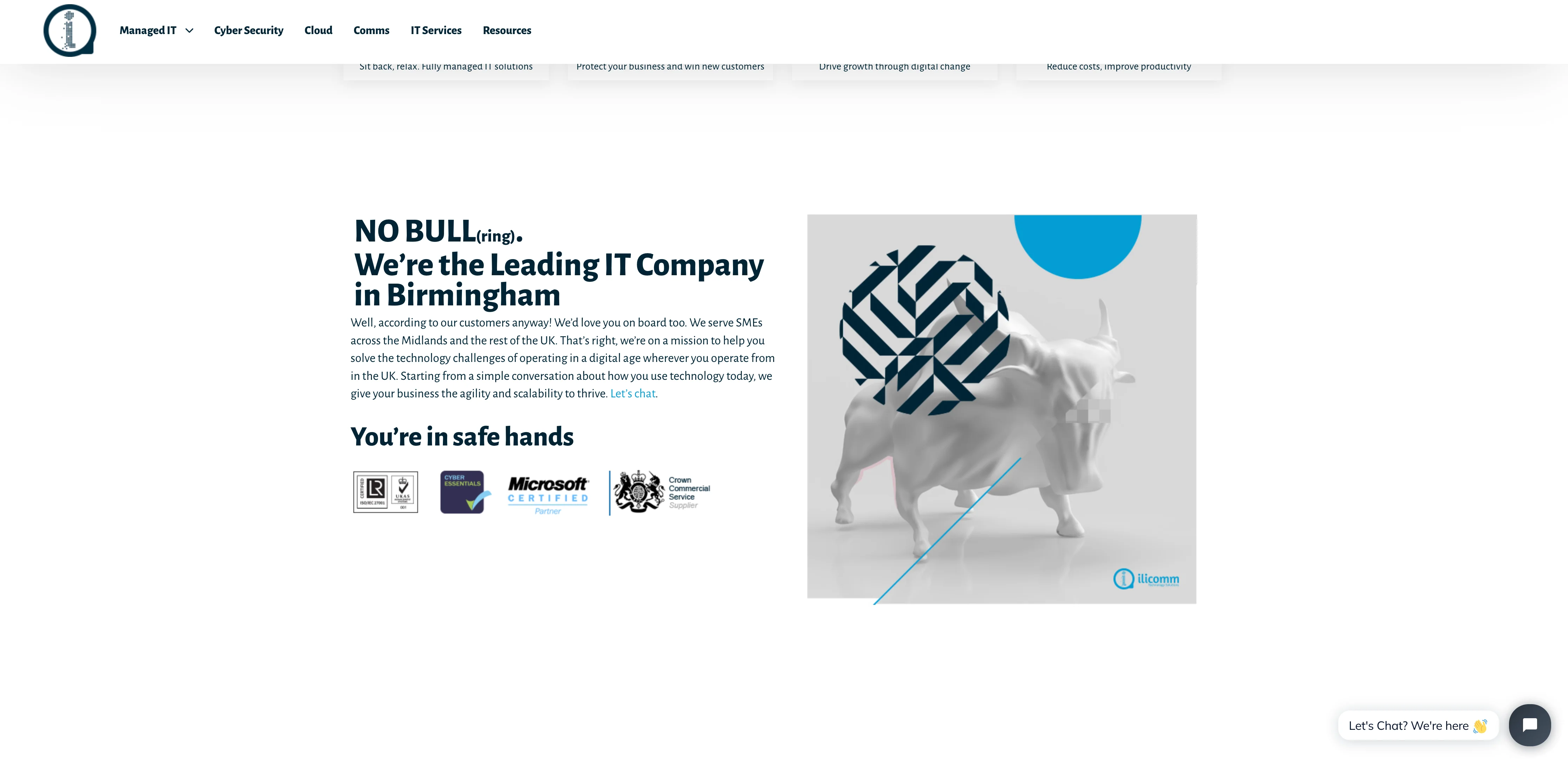
ilicomm
Employees: 10-50
ilicomm was number one! However, I got enraged with all my top five overly using stock images and ilicomm was no exception.
It also lost out on that number one slot due to having no About Us page and favicon. I can easily forgive a missing favicon (little logo displayed on your browsers tabs) but About Us pages are highly visited and your website isn't complete without.
Despite this, ilicomm's website does something the others don't. ilicomm lean on their location and take it further by using location relevant imagery - Birmingham's famous Bull. ilicomm are unapologetic about the market they serve (Birmingham) and this is likely a great business move. The website immediately identifies with their target customer with a bold "#Brum". The design makes the business look technical but professional and the copy adds a spoonful of friendliness and approachability ("No Bull(ring)".
NUMBER 1
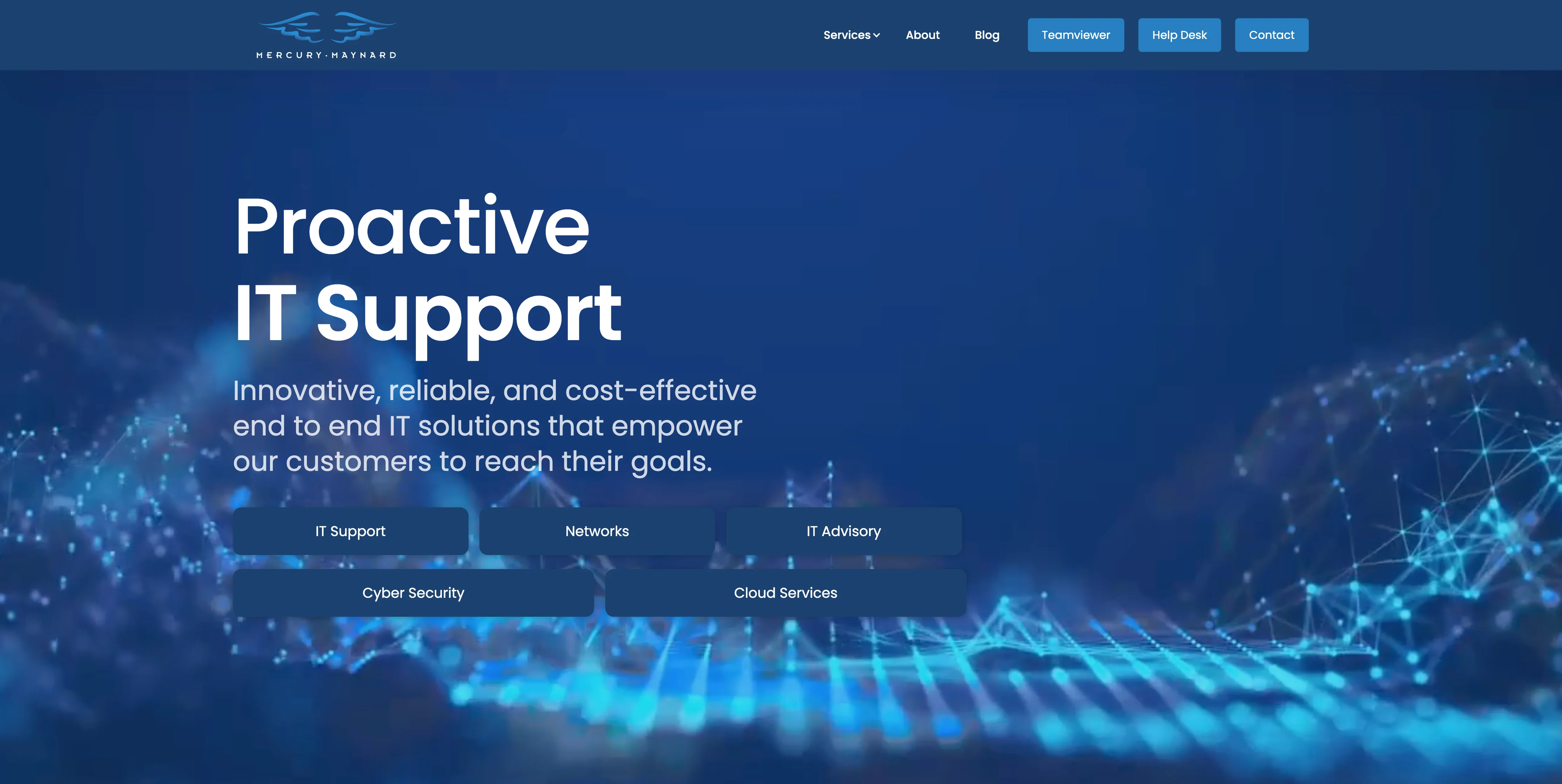
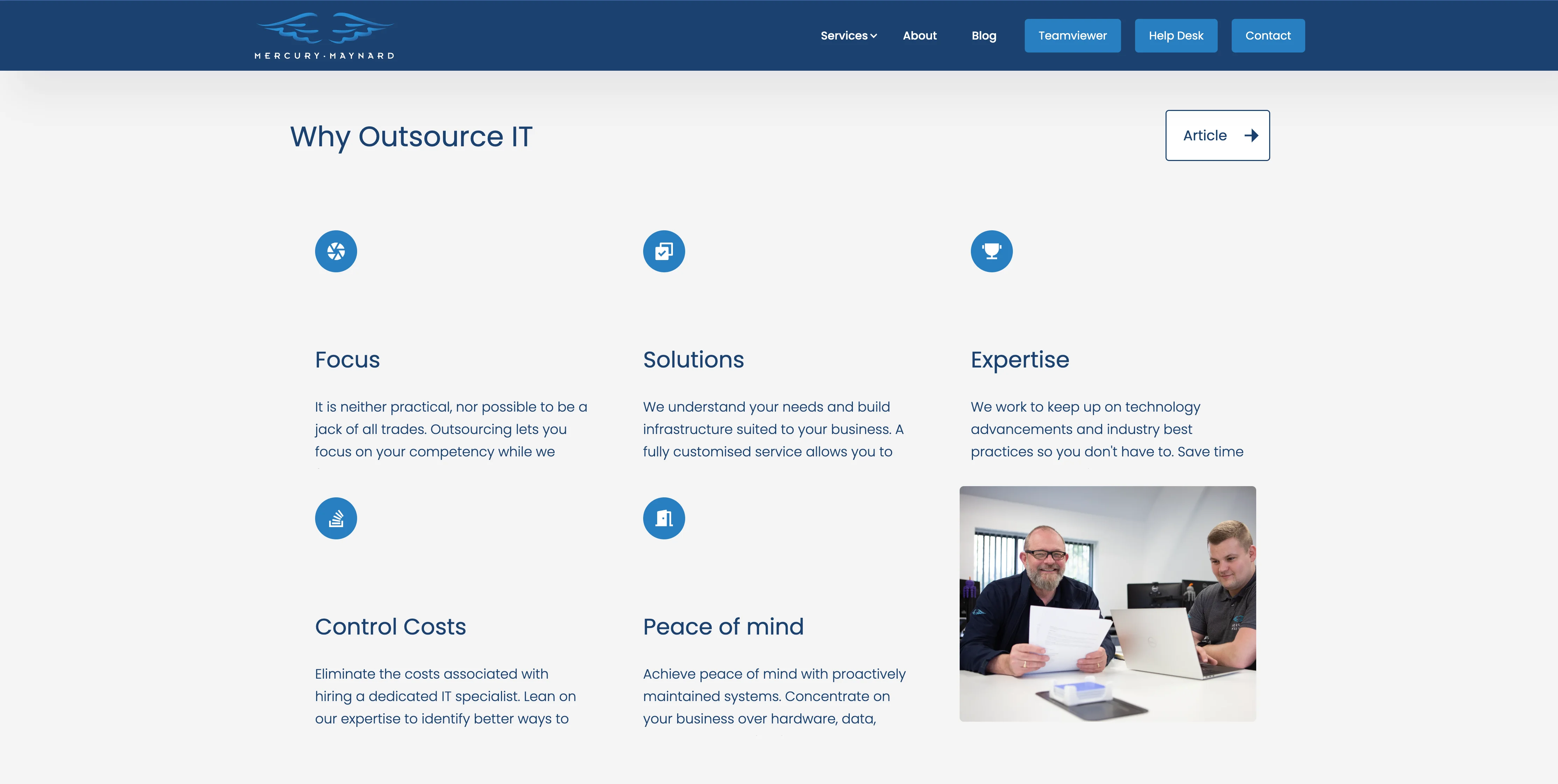
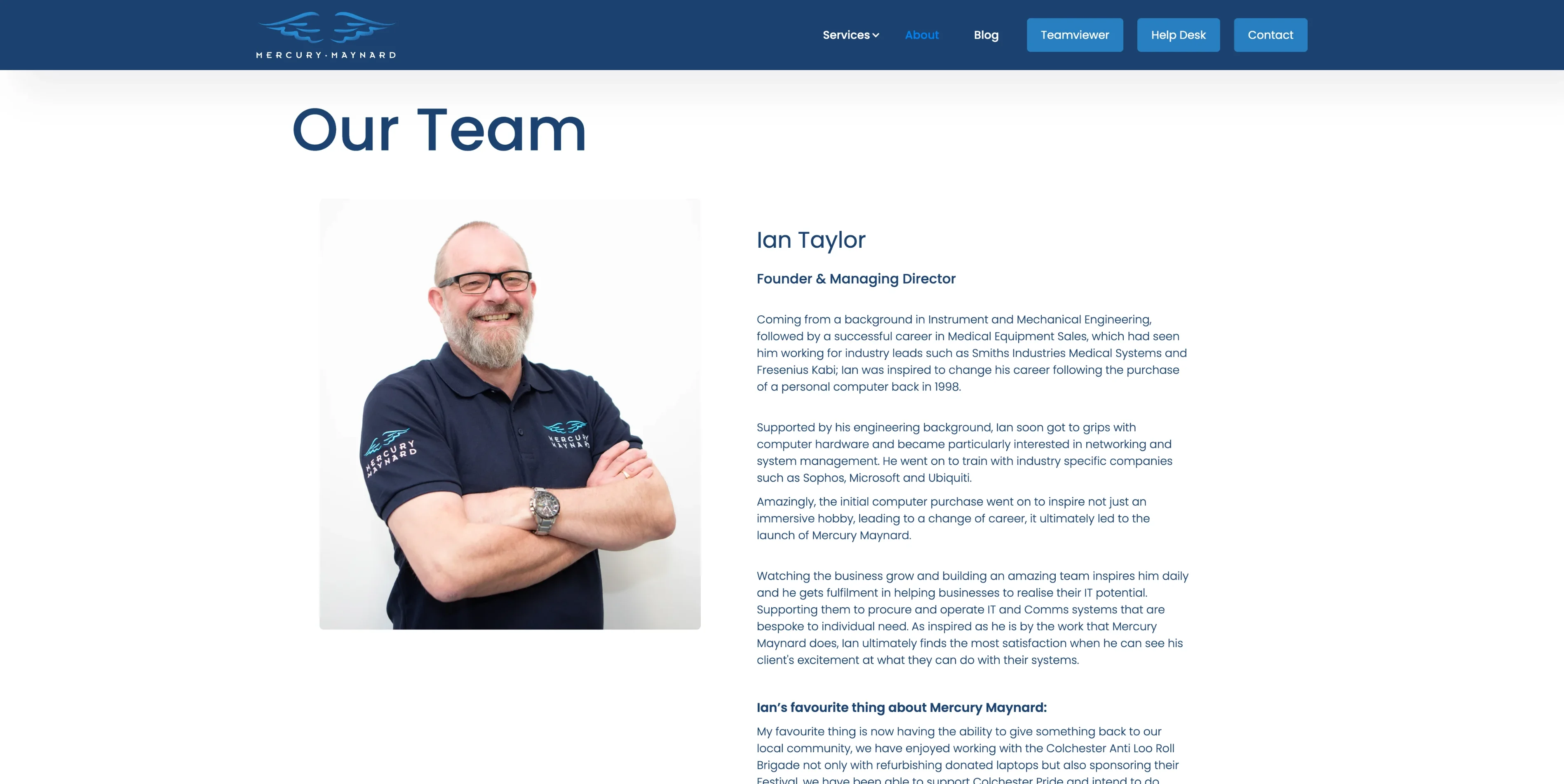
Mercury Maynard
Employees: 2-10
What do you know. It's a website we made!
Despite the ludicrousness of putting a website made by ourselves number one, you'll soon see why. Second to this the end result was certainly not only Yolkk's triumph but the Mercury team also. They not only delivered excellent direction, copy but also ran off and got photos taken without breaking the bank (sub £300.00).
The Mercury team are professionals and now have a website that showcases such. Without the team images throughout it would however loose its sense of approachability. The homepage layout highlights why prospects should engage with IT Support in addition to showcasing testimonials and touching upon processes.
Hopefully being critical of these designs allows readers to further understand the do's and don'ts of IT Support websites. NEVERTHELESS, to even be included in the Top 10 is a momentous achievement and all the websites showcased here are doing their companies and brands proud.
I started this scouring the web to find as many IT Support companies websites as I could. The amount of tabs opened in the process was likely close to world record breaking! However, if you know of an IT Support website that should be on the list above please email info@yolkk.co.uk and let me/ us know.
If you've read this and believe your IT Support website could do with a refresh or are embarking on becoming a brand new IT Support provider, Yolkk would be all too happy to discuss how you can stand out from your competition, build trust with your prospects and ultimately sell your service.

